Notable UI/UX changes coming to Mastodon in 4.3.0

UPDATE 2024-02-03 01:22: I forgot to add that there were changes to the look of the emails that users receive when they sign up to Mastodon.
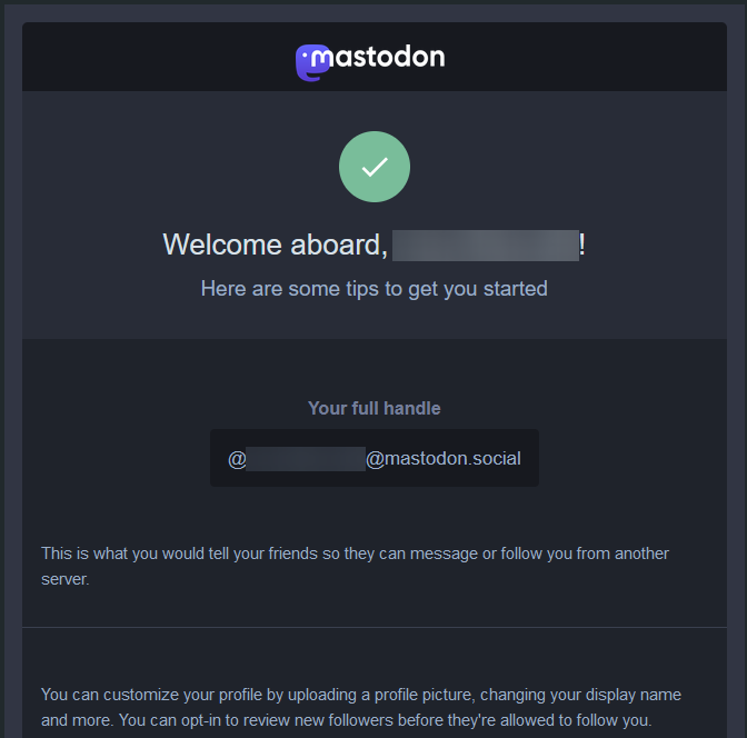
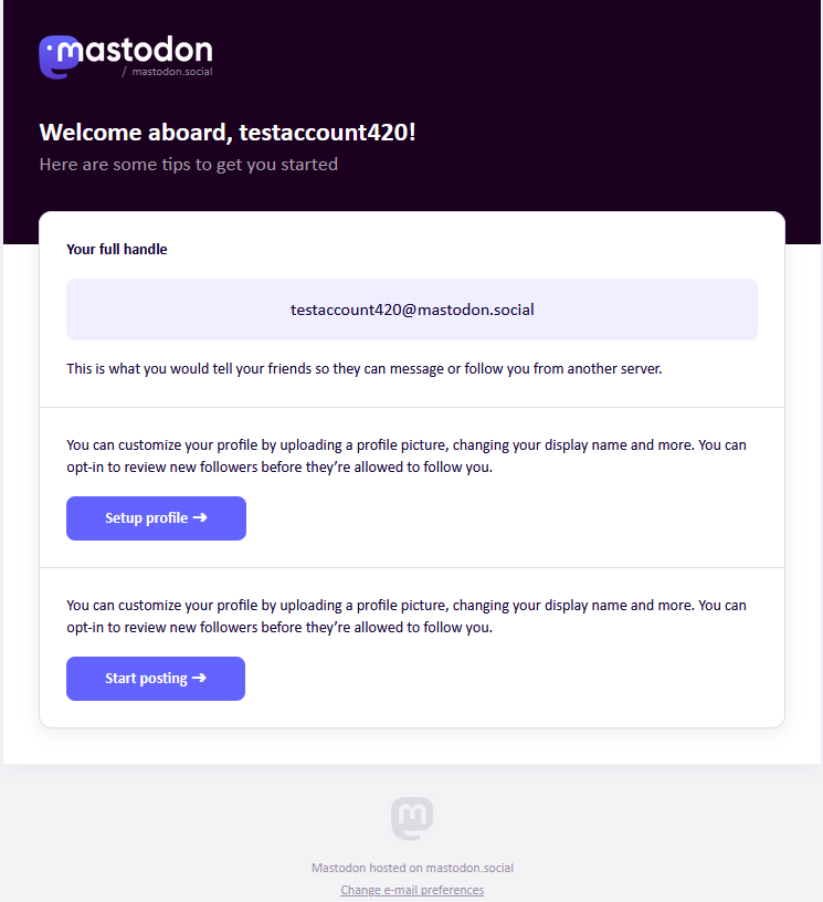
Left: Old look for 'Welcome aboard' email. Right: New look for 'Welcome aboard' email.
ORIGINAL 2024-02-01 22:41: Mastodon are showing off some new changes coming to Mastodon in version 4.3.0
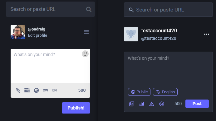
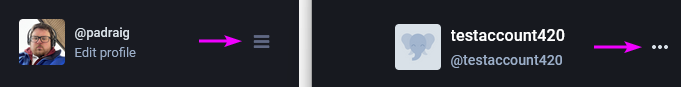
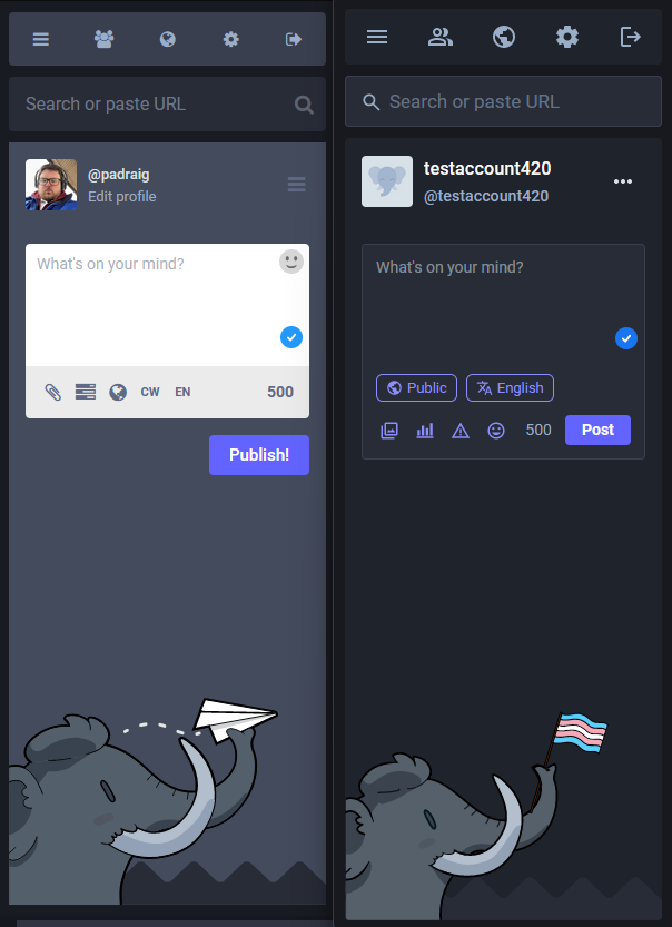
In the screenshot below, you will see Mastodon.ie on the left on Version 4.2.5 and on the right, you will see Mastodon.social on version 4.3.0-nightly.
I will try to go through as much as I can find, but if you find something that I didn't, please message me @padraig@mastodon.ie
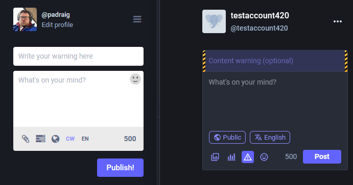
The compose window looks a bit different now:
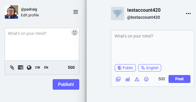
Simple View
- The compose window now matches the theme.
- The privacy option and language option have been moved above the other options.
- The emoji button have been moved down beside the attachment, poll, CW buttons
- There are new icons for attachment, language, poll, CW.
- The post button is now within the compose box.
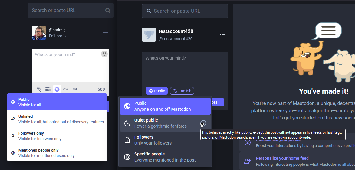
- Public gets the description updated from "Visible for all" to "Anyone on and off Mastodon"
- Unlisted has been changed to Quiet public with the description being changed from "Visible for all, but opted-out of discovery features" to "Fewer algorithmic fanfares"
- They have an information
ibeside Quiet Public with the message "This behaves exactly like public, except the post will not appear in live feeds or hashtags, explore, or Mastodon search, even if you are opted-in account-wide." That is honestly the best way to describe that. Better, clearer language is always appreciated.
- They have an information
- Followers Only becomes Followers, with the description updated from "Visible for followers only" to "Only your followers"
- Mentioned people only has been changed to Specific people, with the description changed from "Visible for mentioned users only" to "Everyone mentioned the post"
These are really simply, effective ways for new and existing users to understand what they are choosing.
It looks like Mastodon has been working on profile, as this has been changed. Now it includes a 'Share' button which uses the device 'Share' prompt.
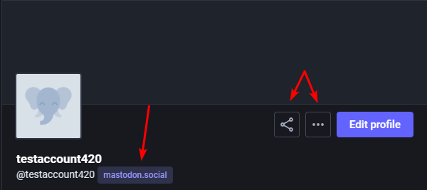
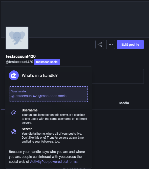
Clicking on mastodon.social now shows an explainer about handles. Clicking 'ActivityPub-powered platforms' expands the box to include the following:
ActivityPub is like the language Mastodon speaks with other social networks.
It lets you connect and interact with people not just on Mastodon, but across different social apps too.
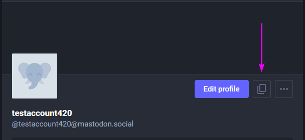
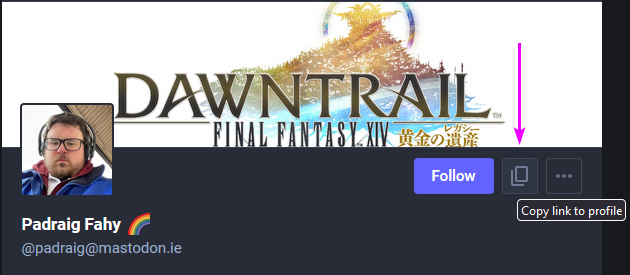
- A new button has been added Copy link to profile, which will provide the full link to the profile
https://mastodon.social/@testaccount420 - It seems you can go to any profile and copy the link of the profile
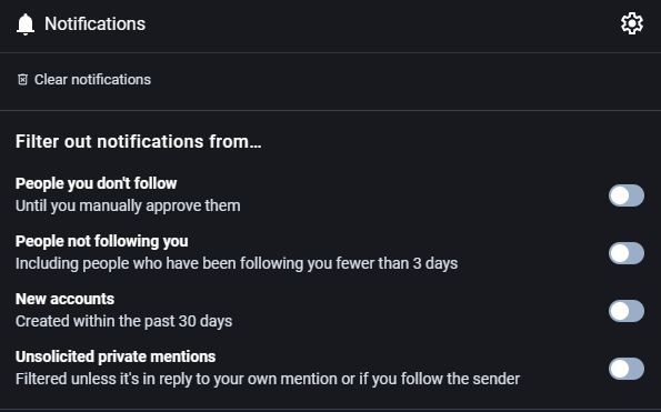
Notifications settings have been updated, which now allow you to filter out specific notifications, such as new accounts or unsolicited private messages.
Looking around, there doesn't appear to be any other visual changes.
What do you think of the changes?
- Follow me on the Fediverse: @padraig@mastodon.ie
- "Why am I seeing these random posts?"
- Gemini:
gemini://padraig.blog/log/notable-ui-ux-changes-coming-to-mastodon-in-4.3.0.gmi
![[The JukeBox] #94 - Junko Yagami - 黄昏のBAY CITY](/content/images/size/w600/2024/04/baycitycover.png)